Creating Dot Density Map with Tableau
Mapping population density
I have always been impressed with night satellite photos. Such images were almost precise representation of habitats; where people live (light) and where they don’t (dark).

So the question I asked myself is: Can I create something realistic like the picture above using Tableau?
Population density maps have been an interesting topic for many data scientists and enthusiasts for a long time. Software packages like ArcGIS provide custom solutions to mapping population density. However, they often use techniques like heat maps, choropleth map, and similar where specific area would be color based on the population density. Only top professional GIS tools like ArcGIS allow for dot density mapping.
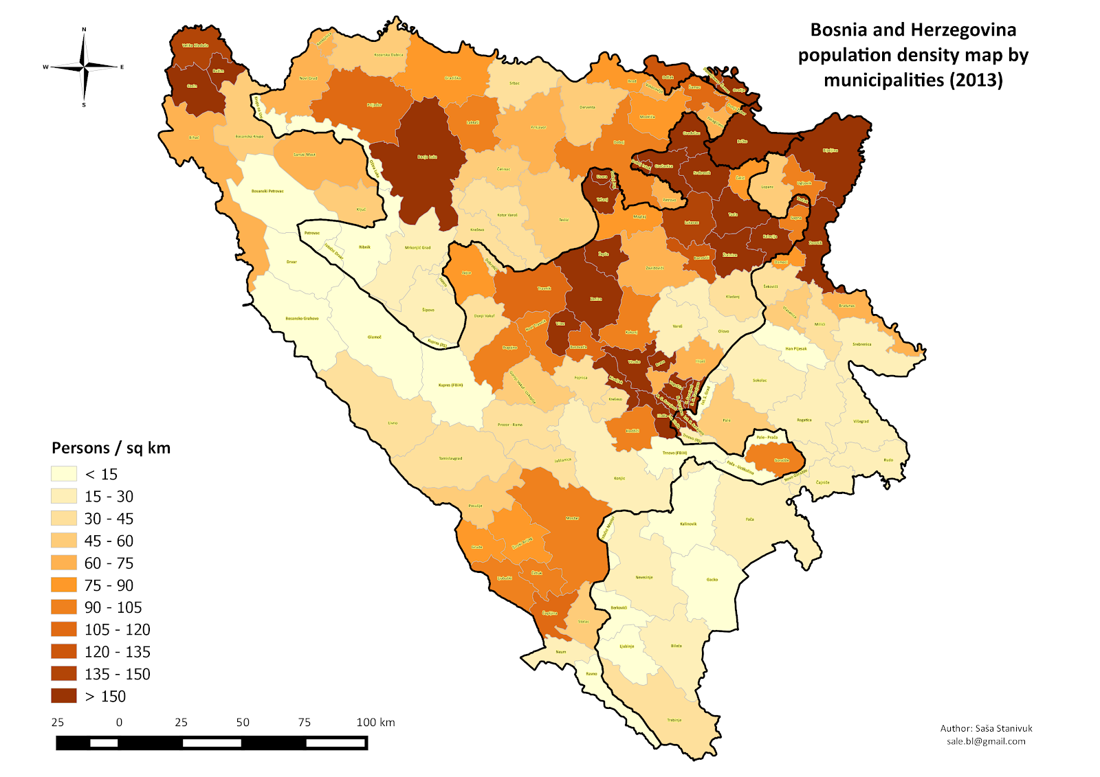
I personally did not like these type of maps, since the color scales tend to provide too broad and imprecise imagery of the population density.
In other words, can we create a dot density layer without using professional GIS tools like ArcMAP. It turns out that with some proper data manipulation, a little bit of math and basic Tableau skills we can come pretty close. Here is how to do it.
Challenge
Is it possible to create a dot density map of Bosnia and Herzegovina using Tableau?
Initial steps
For this project we need following software: Excel, MSSQL, and Tableau Desktop.
Data, data and data.
The key to any data science project is good data. Population data for Bosnia and Herzegovina is available from the 1991 and 2013 censuses.
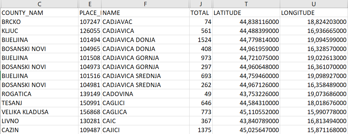
The census provides the following data:
- COUNTY_NAM: Name of the municipality
- PLACE: ID
- NAME: Name of the settlement
- TOTAL: Total number of people in that settlement
In the case of Bosnia and Herzegovina, the census and geocoded data were in two separate data sources, but once they were merged, the final outcome looked as below
Generating lights
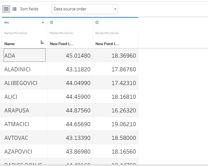
The basic idea was to generate points that would simulate lights in a single settlement. When this is done for the entire region, it resembles a night satellite photo. From a single settlement record which has population size of a 100, we would generate a 100 random points around that geographic area.
There is a number of proposed algorithms on how to do this, but I liked this one. Also, there are some other language specific solutions in JAVA and SQL. With the help of my colleague Mladen, we created SQL script files.
So for every settlement record with N inhabitants, the script generated N records, with latitude and longitude in the approximate radius of 8km (5 miles) from the original records.
The picture above shows that we got 327 records for this particular settlement (latitude: 44,0655; longitude: 19,54385). What you see below is the result of the transformation of the original record above.

Loading data into Tabelau
Once this transformation is done, you can remove all extra fields and keep only latitude and longitude. Tableau allows you to import SQL database and work with records as you can see in the picture below.

After you’ve selected the table you want to use, the data from Tableau will display the first 1000 rows to verify and further transform the data.
The next step is to open a new worksheet and connect the selected table.
Tableau will automatically recognize the latitude and longitude fields as geographic points, however, if this doesn't happen during loading, you can manually change it.
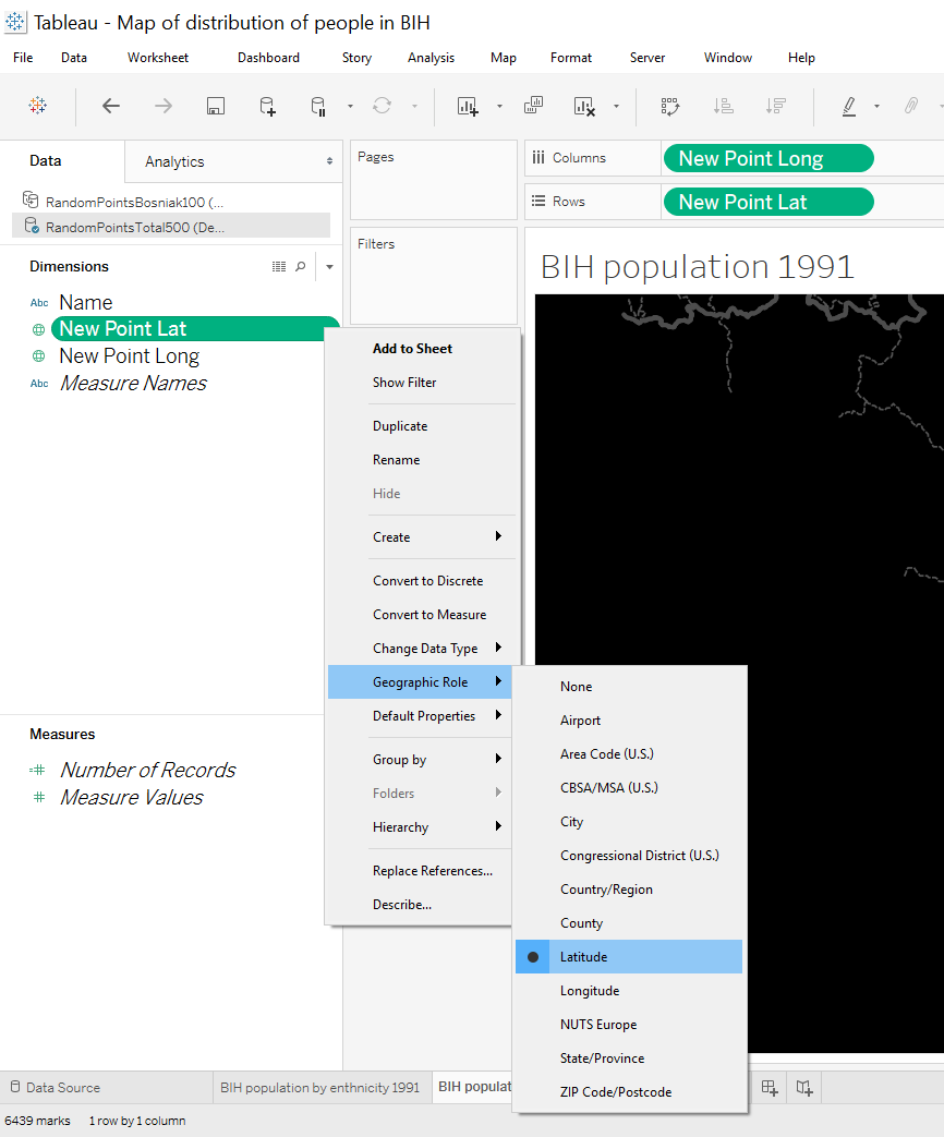
Once this is completed, drag and drop longitude into columns and latitude into rows. Then select minimum size of the points that are generated.

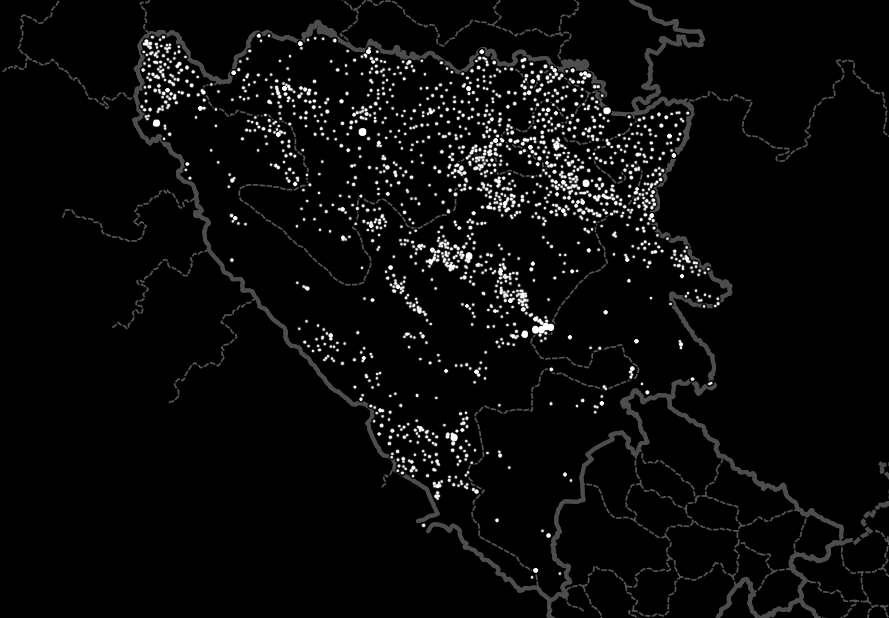
Click on Map / Map Layers, and under Background select Dark Style. The final result should look something like this:
Conclusion
This map is more factual, real in terms of population density and clearly shows where people actually live (light) and where they do not live (dark) according to the 1991 Bosnia and Herzegovina Census.
From the basic settlements record, we started with geocoding settlements, generating random points around each settlement in order to mimic population location up to the final representation of the map in Tableau.
In retrospect
In this dot density map I didn’t generate random points for each person, but rather did one for every 100th person. This reduced the number of points that Tableau should visualize. Depending on your time, machine and result you want, you can play with the size of the records.
The second issue is the size of the geographic location where points are distributed. Clearly if a settlement record counts more than 100 000 (in my case one municipality had over 100 000 inhabitants), population density is not the same as for the settlement with 10 000 inhabitants. Default population spread value was around 8 km (5 miles) in radius but one can play and have different sizes depending on the size of the settlement.
The best results would be if we had information not on the settlement level that sometimes can have tens of thousands of inhabitants, but on the local community (part of the municipality; 4th admin level in most countries) level that would provide more granular data set and thus map more accurate. However, in my case I did not have such data.
Additionally, to make density dot map more informative, you can add another layer of inhabitants category (income level, race, education etc).
A challenge for you
I used the 1991 census data, can you create a dot density map for Bosnia and Herzegovina based on the 2013 census? We’d love to hear from you!
Also, use the same technique to map biodiversity of animals and plants.

